A strong call to action (CTA) is an essential component in virtually every piece of communications you produce. But what is a call to action, you might ask? Simply put, it’s a short string of copy that directs your reader to take an action, such as click on a link, buy a product, call a phone number, sign up for something, or any other directive that relates to what you want your readers to do. Here are 7 tips to help with your next CTA.
1. Be clear about your offer.
There’s no point beating around the bush! Make sure to include a clear directive that outlines exactly what you want your readers to do.

2. Explain the benefit.
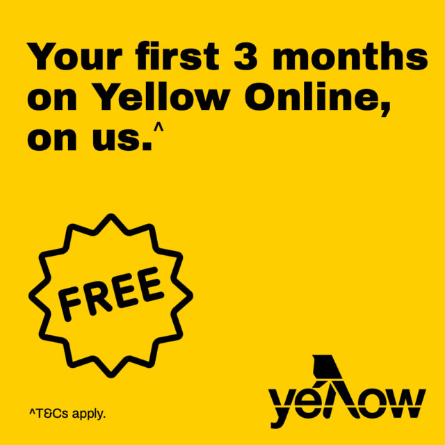
What will readers get if they take a specified action? Whether it’s a free offer, a discount, or anything else – add value to the directive by providing an incentive.

3. Be action-oriented.
It may sound obvious, but make sure to use direct, action-oriented language to help people understand what they need to do. That means no flowery language!

4. Direct the user to a dedicated landing page.
Make the journey to conversion as simple as possible by linking your CTA to a website landing page where the reader can find all the information they need in one place.

5. Keep your messaging relevant.
Think about where your call to action will live (on your website, other websites, social media, etc.) and make sure your message is relevant to the people who will be seeing it.

6. Be crafty with colour and design.
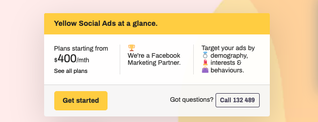
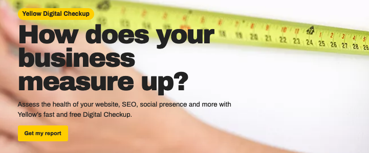
Prominent, eye-catching calls to action and CTA buttons result in more click-throughs and conversions, so choose a bold colour for your CTA that contrasts with the surrounding design.

7. Keep it short and sweet.
In an arena where people are seeing calls to action everywhere, brevity is crucial. While it’s not always possible, a great call to action can be as little as two or three words.

So, there you have it!
You don’t have to be a marketing whiz to create a message that resonates with your audience and compels them to take an action.
To sum up, any call to action you create should pass this litmus test:
- Your CTA is clear, succinct and free of flowery language.
- Your call to action includes a directive to click, book, enquire, shop, download or whatever relates to your business.
- Your message is relevant to the types of people who will see it.
- Your CTA outlines value to the reader – be it monetary or otherwise.
- Your call to action button or wording is eye-catching and stands out from its surroundings.
- Your call to action makes it easy for people to find the information they need (such as by clicking through to a dedicated landing page).
RELATED: 4 free lead generation tools for small businesses.
For more info and free resources on generating leads and growing your business online, visit Yellow Pages’ Business Hub.

